
How to Build an SDR Pipeline Dashboard That Reports in Dollars (Not Activities)

Every Monday, somewhere, an SDR manager presents a dashboard full of green numbers — 1,200 dials, 800 emails, 94% sequence completion — to a VP who asks one question the dashboard can't answer: "How much pipeline did we create, and what is it worth?"
Activity dashboards fail because every metric on them can be inflated without moving pipeline a single dollar. This guide walks through building the dashboard that survives that VP question: what to put on it, how to wire it up in your CRM, the attribution rules you need to agree on before you build, and the 2026 benchmarks to grade yourself against.
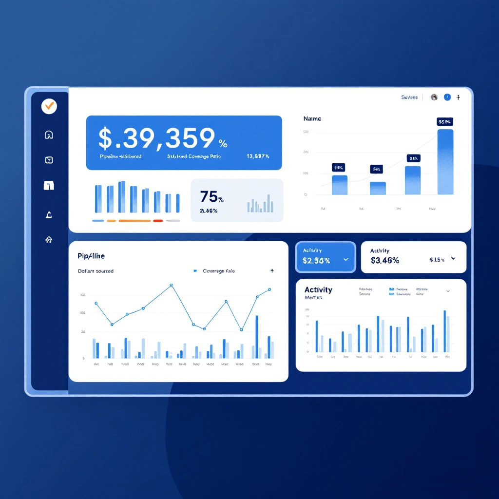
Why Activity Dashboards Lie
Activity metrics — dials, emails, connects — are inputs. They tell you whether work happened, not whether it worked. Two failure modes make them actively misleading as headline numbers:
- They're gameable. An SDR can hit 80 dials a day calling accounts that will never buy. The dashboard glows green while pipeline flatlines. We covered which activity metrics still matter (and the five to kill) in our SDR KPIs and benchmarks guide.
- They hide targeting problems. Fifteen meetings worth $10K each is $150K of pipeline. Eight meetings worth $50K each is $400K. An activity dashboard scores the first SDR nearly twice as high. A dollar dashboard tells the truth.
The fix is not to stop tracking activity — it's to demote it. Activity belongs at the bottom of the dashboard as a diagnostic, not at the top as a headline.
The 7 Widgets That Belong on the Dashboard
A good dashboard has 5-7 headline metrics, ordered so the first row answers the VP question and the last row explains it. Here is the layout we recommend:
| # | Widget | What It Answers | Update Cadence |
|---|---|---|---|
| 1 | Pipeline sourced ($) — this month vs. target | Are we creating enough pipeline? | Daily |
| 2 | Pipeline coverage ratio (pipeline ÷ next-quarter quota) | Will sales hit the number? | Weekly |
| 3 | Pipeline sourced ($) per SDR | Who is targeting well, not just working hard? | Weekly |
| 4 | Meetings held → opportunity rate | Are meetings real or vanity? | Weekly |
| 5 | Average opportunity value by source (outbound vs. inbound vs. website signal) | Which motion finds bigger deals? | Monthly |
| 6 | Signal-to-first-touch time | Are we fast enough on intent? | Daily |
| 7 | Activity diagnostics (dials, emails, connects) | Why are the numbers above moving? | Daily, bottom row |
Widget 6 is the one most teams skip. Speed-to-signal is a leading indicator of everything above it — we've written about why the first 24 hours after a signal decide whether it becomes a meeting at all.
Step 1: Agree on Attribution Rules Before You Build
This is where most dashboard projects die. "Pipeline sourced by SDR" is meaningless until everyone agrees on three definitions:
- What counts as sourced? Standard rule: the SDR booked the first meeting on an account with no open opportunity and no sales-accepted activity in the last 90 days. Write the window down. The 90-day number is negotiable; having a number is not.
- When does pipeline count? Count dollars when the opportunity is sales-accepted (stage 2+), not when the meeting is booked. Meetings that never convert shouldn't inflate the number — that's just activity theater with extra steps.
- How do you value early-stage opportunities? Use the AE's entered amount once discovery is done. Before that, use your trailing 6-month average deal size for that segment. Do not let SDRs enter their own opportunity values — that's asking for inflation.
Get these three rules signed off by sales leadership in writing. Every dashboard argument you'll ever have traces back to one of them.
Step 2: Set Up the CRM Fields
You need surprisingly little. In HubSpot or Salesforce:
- "Sourced by" field on the opportunity (picklist: SDR name, AE, Inbound, Partner). Set by workflow when the opportunity is created from an SDR-booked meeting, not by hand.
- "Source motion" field (picklist: Cold outbound, Warm signal, Inbound follow-up). This powers widget 5 — and it's where most teams discover their "cold" outbound was actually warm. If you run website visitor identification, tag opportunities where the account visited your site before first touch. Teams that do this consistently find a third or more of "outbound" pipeline had a prior intent signal.
- Timestamp fields: signal detected (if applicable), first touch, meeting booked, meeting held, opportunity created. These power the velocity widgets.
That's it. Resist the urge to add fifteen fields — every field that requires manual entry will be wrong within a month.
Step 3: Build the Reports
In HubSpot: Reports → Create report → Single object (Deals). Filter: create date this quarter, "Sourced by" is any SDR. Sum of amount, grouped by sourced-by. That's widget 1 and 3. Coverage (widget 2) is the same report divided by team quota — use a calculated field or just annotate it. Meeting-to-opportunity rate needs a funnel report from meeting held → deal created.
In Salesforce: an opportunity report grouped by your custom Sourced_By__c field, summed on Amount, filtered to created date this quarter. Add a dashboard component per widget. The velocity widgets come from formula fields subtracting your timestamp pairs.
In a spreadsheet: perfectly fine under ~5 SDRs. Weekly CRM export, pivot on sourced-by, sum on amount. The dashboard matters more than the tooling.
With AI tooling: if you want live data joined across CRM, marketing, and finance without BI licenses, we documented how to build a RevOps dashboard with Claude Code — same principles, more automation.
Step 4: Grade Yourself Against 2026 Benchmarks
Numbers without benchmarks are decoration. Here's where the market sits in 2026:
| Metric | Average | Top Performers |
|---|---|---|
| Pipeline sourced per SDR/month | $150K-250K | $300K-500K |
| Pipeline sourced per SDR/year | ~$3M median (Bridge Group) | $4M+ |
| Pipeline coverage ratio | 3-4x quota | Win-rate adjusted (see below) |
| Meetings held → opportunity | ~50% | 60%+ |
| Meeting show rate | 75-80% | 85%+ |
Two caveats that matter:
- ACV changes everything. Sub-$25K ACV teams average roughly $190K/month in sourced pipeline per SDR; enterprise teams above $25K ACV run $600-700K/month. Benchmark against your segment, not the blended average.
- Coverage depends on win rate. The lazy "3x coverage" rule assumes a ~30% win rate. An SMB team closing 60% of qualified opportunities needs under 2x coverage; an enterprise team winning 15% needs 5-6x. Compute yours: required coverage = 1 ÷ win rate.
If you're reading this in the back half of the year, run the same math against the calendar — our Q4 pipeline planning guide shows how September coverage gaps become December misses.
Step 5: Run the Monday Meeting Off It
A dashboard nobody argues about is a dashboard nobody uses. Structure the weekly SDR meeting as three questions, top row to bottom:
- Are we on pace? (Widgets 1-2.) If yes, skip to wins. If no —
- Where is the gap? (Widgets 3-5.) One rep behind, or everyone? Deal sizes shrinking, or meeting conversion dropping?
- What input do we change? (Widgets 6-7.) Only now do you talk about activity — and only the activity connected to the diagnosed gap.
This inverts the standard SDR meeting, which starts with activity and never gets to dollars. Pair it with a tight morning workflow for reps and the dashboard stops being a report and starts being an operating system.
Common Failure Modes
- Counting booked meetings as pipeline. Meetings are widget 7 material. Dollars enter the dashboard at sales acceptance, full stop.
- Manual source tagging. If a human has to remember to set "Sourced by," the field decays. Automate it from the meeting link or sequence enrollment.
- Ignoring signal-sourced pipeline. If your SDRs work website visitor signals but the dashboard lumps it all under "outbound," you can't see that signal-sourced deals close faster and bigger — which is usually the single most useful insight the dashboard produces.
- Rebuilding monthly. Pick the seven widgets, run them for a full quarter before changing anything. Trend lines are the whole point.
FAQ
How do I track lead outreach automation performance and pipeline impact in dollars on one dashboard? Put dollars on top and automation metrics on the bottom. Pipeline sourced ($) and coverage are your headline; sequence reply rates, connect rates, and send volumes are diagnostics that explain movement in the headline. The wiring that connects them is the "Sourced by" and "Source motion" fields on the opportunity (Step 2). If your outreach runs through a sales engagement platform, sync enrollment data into the CRM so every opportunity traces back to the sequence that created it.
What's the minimum viable version? One report: sum of opportunity amount, filtered to SDR-sourced, this quarter, grouped by rep — next to the team's pipeline target. Everything else is refinement.
Should SDRs be comped on pipeline dollars? Increasingly, yes — at least partially. Comp on meetings alone and you get meetings; comp on sales-accepted pipeline dollars and reps self-select toward better accounts. Most 2026 plans blend both, weighted toward accepted pipeline. If your team is exploring AI BDR tooling, dollar-based measurement matters even more — it's the only fair way to compare human and automated sourcing.
How is this different from a RevOps dashboard? Scope. A RevOps dashboard covers the full funnel through closed-won and retention. This one answers a single question — is the SDR team creating enough pipeline, in dollars, from the right sources — and hands off downstream.
MarketBetter tells your SDRs who to contact and what to do next — and because every signal, touch, and meeting is captured automatically, pipeline attribution comes free. See what a dollars-first outbound motion looks like: book a demo.